IBIF
Caye Caulker 2021
Visual Graphics Case Study · Brand Identity

Island Boy Ice Factory. Caye Caulker

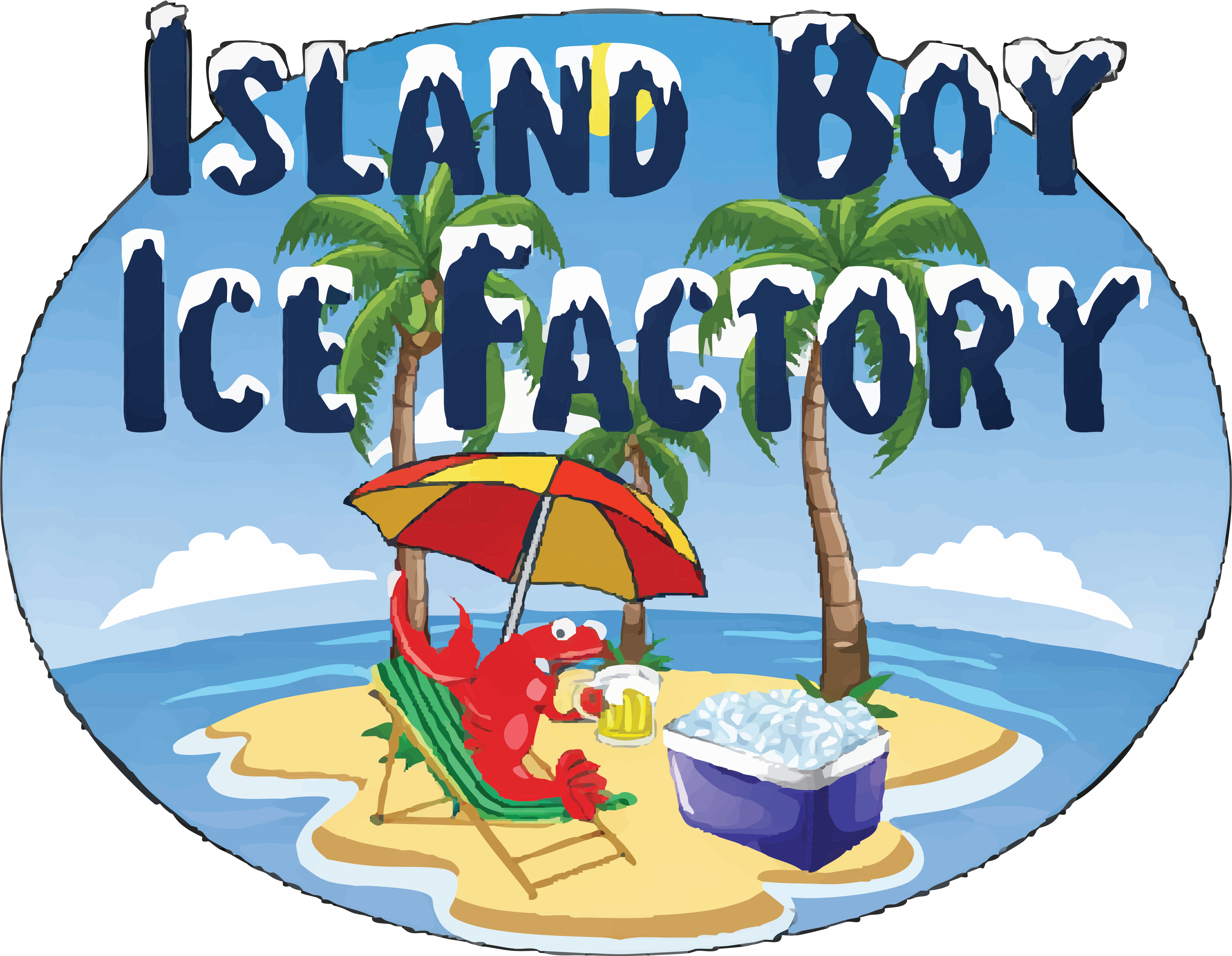
A wholesale & retail ice business with island roots and a working-man's pride — rebranded with the cool weight it deserves. We took heritage, salt air, and lobsters, and pressed them into a logo that travels well on carts, bags, and stickers.

❄ Brand Identity 🦞 Caye Caulker 🧊 Full System
2021
Year Delivered
#1
Brand Identity
6
Brand Colors
Lobster Pride

Heritage on the rocks.

Island Boy Ice Factory is a wholesale & retail ice business in Caye Caulker — a sandy strip of Belize where the lobster traps outnumber the lampposts. The owner came to us with one ask: a brand that respected the work behind it, and the island it came from.

No clip-art penguins. No corporate snowflakes. Something that could sit on a 40lb ice bag headed to a restaurant kitchen, on a delivery cart, and on the side of a cooler at a roadside bar — and feel equally at home in every one of those places.

The result had to travel: from a freezer shelf to a ferry dock. From a business card to the side of a golf cart. Legible at fifty feet, sharp at five inches.

Client
Island Boy Ice Factory
Location
Caye Caulker, Belize
Discipline
Logo & Brand Identity
Year
2021

"Make it look like us. Not like every other ice company on Google."

— The brief, summarized
Three pillars carved
from the same block.

01
🌴
Rooted

The lobster — a daily reality on Caye Caulker — anchors the mark in place. It's not decoration, it's a passport. Every element of the brand traces back to island identity.

02
📦
Reliable

The ice box silhouette is steady, square, dependable. Restaurants run on the assumption their ice will arrive fresh and on time. The brand reflects that contract.

03
👁
Recognizable

Bold typography and high-contrast color make the brand legible across a bag of ice in a freezer or on the back of a delivery cart at full speed down Caye Caulker's main strip.

A palette that doesn't melt
under the sun.

Cool blues hold the cold; coral and sand keep it human. Built for print, signage, and the inevitable Instagram repost from a happy customer.

Lobster
#DC2329
Primary · Accent
Sky
#42A1D8
Background · Ice
Trees
#497A3A
Accent · Nature
Deep
#193157
Typography · Dark
Sea
#5A9CD0
Secondary · Water
Ice Box
#312F88
Icon · Deep Accent

From a frozen brief
to a brand that ships.

The Visual Graphics process — same four steps for every project, whether it's an ice factory or a fashion boutique.

01
Discover

Conversations with the owner. Walks past the existing setup. Photos of the ice bags, the golf cart, the freezer — finding what was already working and what wasn't.

02
Concept

Three directions: literal (the box), heritage (the lobster), and a hybrid lockup combining both stories. The third direction was always going to win.

03
Refine

We tuned proportions, tested it small (sticker), large (signage), and on a real ice bag mockup — until every weight and curve felt earned.

04
Deliver

Final files in every format the business needs — SVG, PNG, PDF, mono versions, social cuts. Ready for the bag printer, the sign shop, and the feed.

A brand that survives
the sun, the salt,
and a 40lb ice bag.

Logo on ice bag
Ice Bag · 40lb

The logo holds up at every scale. Bold enough to read through condensation on a freezer shelf. Clean enough to photograph well for social.

Primary Application
Logo on golf cart
Golf Cart Side Wrap

The island's delivery vehicle — the brand rides it daily through Caye Caulker's sandy streets.

Signage
Round sticker
Sticker · Round Die-Cut

A round die-cut sticker that ends up on coolers, boats, and windows all over the island.

Collateral

Your brand deserves
to look incredible.

Reach out and let's talk about what your business needs. Every great brand starts with a conversation.